

He’s already run the rule over the home shirts and now Jimmy Lee is back and this time the aways kits are getting it…
As the Superliga season kicked off last week, it was great to have football back, but I kept finding myself making mental notes about the shirts each club was wearing. A few weeks back I complied a ranking of the home shirts for each club, but now it is time to do the same for the alternate shirts.
In Argentine football, unlike in European leagues, you will regularly see your club wear their alternate shirt at home, and no, it is not just to help the marketing department sell more shirts. In Argentine football, the traveling club gets first pick of the shirt they will wear, often forcing the home club to wear one of their other shirts. So, in a way, the change strip is almost as important as the home shirt, because it will often be worn at home.
So let’s get into the rankings.

26. Patronato
I get what Patronato is trying to do with this shirt. I understand that this shirt represents the Paraná and Entre Rios rivers and landscape. It is unique and original, but to your standard football fan who is simply looking at this shirt for aesthetics reasons, this shirt is a mess. If it was white with the black and red sleeves, it would be about mid table of this list. But as it currently stands, it is not a shirt I would wish my worst enemy to wear.
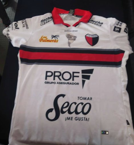
25. Colón
If you take off the sponsors and have just a white shirt with the horizontal stripes across the chest, it looks like a polo shirt I may have worn in the 90s. And today if I saw a picture of myself wearing that shirt, I would be extremely embarrassed. The combination of this shirt and the home shirt makes Colón the clear loser of the Superliga shirt promedios.

24. San Martín de Tucumán
For those of you who are new to San Martín de Tucumán since this is their first year back in the top flight since 2009, the club’s nickname is the Tigers, which is highlighted in the design of this shirt. Wait, my apologies, that was a complete and total lie. They are not called the Tigers, but based on this shirt you probably would have believed me. I don’t understand the red tiger skin print on this shirt and let’s just leave it at that.
23. Defensa y Justicia
At least their alternate shirt did not finish in last place like it did in the ranking of home shirts. So congratulations to the fans of El Halcón, your club is on the way up. While it might not be as bad as the principal design, it looks like they took a plain white shirt and randomly added different stripes of all different lengths. Similar to Patronato, the shirt is a mess and painful to look at.
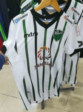
22. San Martín de San Juan
Hmm, I wonder where I can find updates on San Martín de San Juan on social media? Where should I look to find it? It would be too hard to Google it. Oh perfect, right there on their shirt are the handles to the club’s Twitter and Instagram. Perfect. This shirt is already ugly, but putting the social media handles on the shirt makes it look cheap.

21. Godoy Cruz
El Tomba have recently released a new home shirt but has not yet released an alternate. The shirts are now being made by Kelme and I would expect an alternate to come out soon. But the most recent shirt made by Macron was all white with blue letters. This is a solid design, but poorly executed. The font is all over the place, different styles and sizes. Hopefully Kelme makes positive updates in the new shirt.

20. Aldosivi
Generally green and yellow are not aesthetically pleasing colors, but these bold tones with the white base looks a lot better than if the shirt was only green and yellow, or in other words, exactly how their home shirt is. Which is why this Aldosivi shirt ranks much higher than their other one.

19. Unión
Another white shirt (13 of the 26 shirts have white as the principal color). All the sponsors are in red which looks nice and one of the sides of the shirt is also red, but the other side is blue. Unión regularly uses blue accents on their shirts and shorts, which is fine, but having one side of the shirt blue is unnecessary and makes the shirt look uneven. The ‘papermark’ on the shirt is in homage to the flag of Santa Fe, it is a nice touch.

18. Boca Juniors
I almost love this shirt. White base with the blue and yellow band across the middle would be perfect. But then they add this seismic design and make the shirt look like it is graphing an earthquake. But don’t blame Boca for this, blame Nike. This is their current shirt template and Boca is just one of the many teams that is a victim of it.

17. Rosario Central / 16. San Lorenzo
Both Central and El Ciclón are also victims of the Nike template. White base with color sleeves. Both shirts are clean and attractive, but neither is original.
15. Atlético Tucumán
This shirt is almost everything you want from an alternate shirt. It’s a nice deep color and is not too extreme and is still close to the club’s core colors. Unfortunately, it might be just a little too plain. It would be nice if they added a little something extra to make it stand out.

14. Racing Club
This shirt brings in elements of the home kit with the sky blue and white, but the majority of the shirt is the darker shade of blue. The colors work well together. Unlike the Atlético Tucumán shirt which is a similar shade of blue, Racing add a touch of design to make the shirt pop.

13. Huracán
I love when a club makes a mirror image of their home and away shirt. That is exactly what El Globo does. This shirt is red with white lettering but also includes some subtle designs into the red to help it stand out.

12. Tigre
This is essentially what Boca’s shirt could have looked like if they decided to just do a straight line instead of the readout from a seismometer. Tigre took the design of their principal shirt and kept the same template but changed the colors. The only negative to this shirt is the blue stripes along the side. If they kept the sides white, it would have been a cleaner look.
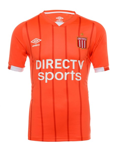
11. Estudiantes
Is this shirt red? Is it pink? Is it orange? It certainly is a unique color and El Pincha is the only club with a color like it. It’s not an ugly color, but it’s also not a color I could ever see myself wearing. The shirt would also look better as one solid color instead of the darker red pinstripes.
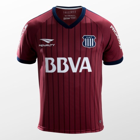
10. Talleres
Similar to Estudiantes, I also don’t exactly know what to call this color, but it is bolder than whatever color El Pincha had on their shirt and goes well with the dark blue color of Talleres. But once again, the shirt would be better without the pinstripes.

9. Gimnasia
Just like Huracán, El Lobo takes their home shirt and make the alternate an exact mirror using the same colors. This design gives the Platense club a very appealing change strip.

8. River Plate
Purple might not be a classic River color, but the additional intricacies in the design shoot this shirt up the rankings. The parquet with the different tones of purple is excellent. And until River adds a chest sponsor, this shirt is even better.
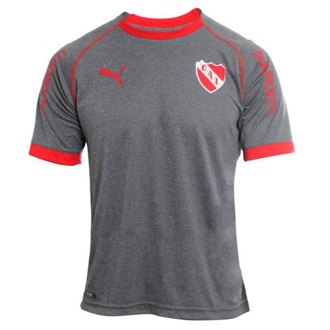
7. Independiente
At first look, I assumed this was a tee-shirt and not an actual football shirt. When I realized it was their official shirt, I asked myself two questions. First, is grey the best color to wear? Yes, it is, because grey matches well with everything. And second, would I wear this shirt? Of course, I would. Nice job Independiente.

6. Banfield
El Taladro is one of the few clubs that almost always has the same color away shirt, orange. With Hummel taking over as the shirt designer, they stuck with orange but added an additional touch to it. The shirt has two tones of orange with horizontal stripes. One is a deeper orange and the other is closer to a salmon color, they add one green stripe to bring it all together. Orange generally is not an attractive color for a football shirt, but this time, Banfield pulls it off.

5. Lanús
The other club from the Clásico del Sur comes in one spot above their hated rivals. Peak Sport really nailed both the home and alternate shirts for the club. Peak takes a classic design in Argentine football, most famously used by Boca, and adds the unique colors of Lanús.

4. Belgrano
What were my two questions for the Independiente shirt? Is it grey and would I wear it? This shirt is grey and black and has the classic Belgrano sky blue in the lettering, which really makes it pop off the shirt. But more importantly, would I wear it? Uhh yes, I am the proud owner of this shirt.
3. Argentinos Juniors
What an upgrade for El Bicho. Their shirt last season was a mess and probably would have ranked towards the bottom of the table. Argentinos presented this alternate shirt on the 114th anniversary of the club with the caption “We are dressing for the Gala.” The all black shirt with a dark grey diagonal band is absolutely classy. This is the tuxedo tee-shirt of Argentine football.
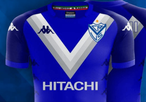
2. Vélez Sarsfield
Kappa really brought it with their first design for the club from Liniers. They stayed true to their classic colors, white and blue, but added different tones of white and grey into the “V” on the chest. And unlike the previous design by Umbro, the “V” is duplicated on the back as well.

