
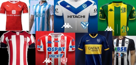
We are two weeks into the 2019-2020 Superliga season. The football so far has been, well, let’s just say there is still room for improvement. But wait, we are not here to talk about football. It’s a new season which means new fashion. Clubs will once again ask you to open your wallet and purchase a shirt that looks pretty darn close to what you bought 12 months ago, but is just different enough, that you have to have it.
So which teams brought their A game this season? Which teams missed the mark? We broke down all 24 Superliga home shirts into seven different categories to determine which club looks the most stylish on the pitch.
No way on earth I’m wearing that shirt
24. Defensa y Justicia:

Simply put, this shirt is way too busy. From the green on the shoulders, to the second stand-alone green line just below it, to the chevron designs in the yellow. This shirt has little idea what it wants to be, or maybe it does, and it wants to be ugly.
23. Arsenal:

Usually not having a sponsor would be a positive thing, but not with this shirt. Get rid of the red on the shoulders and sleeves as well as the camouflage design inside the red and this might not be such an atrocity.
22: Godoy Cruz:

This shirt was ugly last season when Kelme released it. They have yet to release a new shirt for the current season, so the combination of ugly and old really hurts the club from Mendoza.
Not for me, but I’ve seen worse
21. Talleres:
Blue and white are classic football colors. So how is it possible to mess up a blue and white striped shirt? Well done Talleres, you’ve accomplished the impossible.
20. Gimnasia:

Why do you have to carry the chest stripe onto the sleeves? It’s like carrying Frida Kahlo’s unibrow all the way over and giving her sideburns. They got a little too carried away when designing a potential masterpiece.
19. Central Córdoba:

Everything about this shirt screams hideous. So why do I secretly love it? Because this is the first time Santiago del Estero has had a team in the first division in 48 years. Might as well make sure the whole world knows which city and province is being represented.
18. Huracán:

Clean white look. I almost love it, but just a little too plain. They added the tribute to their stadium for 70th anniversary, but it looks out of place as the only black print on the shirt.
Why do teams try and get experimental with the collar?
17. Patronato:

A solid evenly striped shirt. But please explain to me why they added that white section at the front of the collar?
16. Banfield:

I never realized that Banfield’s nickname was the vipers. That’s why they have those gold viper teeth coming out of the front of the collar. Wait, that isn’t their nickname? Ok, then that collar makes no sense.
15. Estudiantes:

Another shirt that falls into the category of “close to perfect but…” The solid red shoulders, the little white accent on the neck, and the black on the bottom of the sleeves stop this shirt short of its high potential.
14. Rosario Central:

A gorgeous shirt that get points deducted for a weird feature on the collar. What’s the point of the section cut out at the front? Just in case some fans want to show off some extra chest hair? Also, because the yellow stripes do not continue behind the “TCL” sponsor section, it makes it look like they slapped a sticker onto the shirt and called it good.
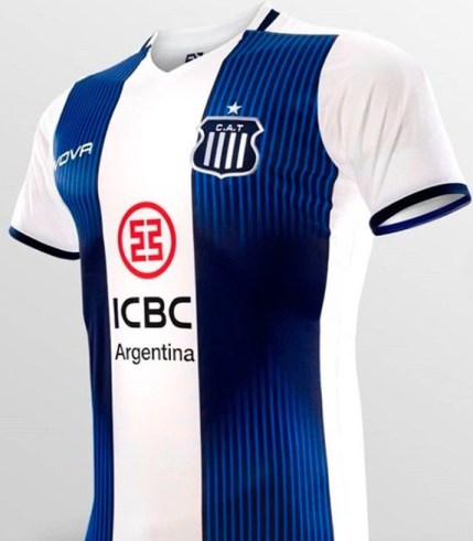
13: Atlético Tucumán:
White and sky-blue stripes make for a perfect shirt combination. This version has a deeper celeste than in years past and it looks nice. Stripes are evenly spaced and not to thick or too thin. So why add the polo shirt style collar? You came so close just to fail at the last minute.
If red is your color, these might be the shirts for you
12. Colón:

Huge improvement this season for Colon. But those “Flecha Bus” sponsors need to be moved from the collarbone up or over a about 20 centimeters onto the shoulders or sleeves.
11. Lanús:

This was one of the best shirts last season, but its been over 12 months and it’s time for Lanús to release a new design. Still a nice shirt, but it’s hard to put it higher on a ranking of 2019-20 shirts when it’s a shirt from 2018.
10. Unión:

The number of sponsors does not impact how I feel about a shirt. I don’t mind if it has six, seven, or eight different sponsors on it. What’s more important is size, placement, and color. This is a beautiful shirt but sticking that “Red Mutual” sponsor right at the top in the middle is simply not a good spot.
9. Argentinos Juniors:

If there was an award for most improved shirt over the past couple of seasons, it would have to be given to El Bicho. Just look where they were three seasons back when they returned to the Superliga.
Now things are starting to get real
8. Aldosivi:

Green and yellow are not an aesthetically pleasing color combination, so why do I find myself liking this shirt? I don’t know, I just do, ok!
7. Racing:

As previously stated, these colors are perfect. I even like the diamond designs inside of the celeste stripes that add additional flavor to the shirt. But keep those diamonds to the body of the shirt and off the sleeves. It feels like I’m looking at a 3D magic eye picture. And now I have a headache.
I’ll take a side of middle-eastern airplane money with my football shirt
6. River Plate:
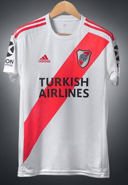
This is what a River shirt should look like, or at least it was two weeks ago before they added the “Turkish Airlines” sponsor. Look, at the end of the day, teams need to make money. Without money, there is no football (or at least not quality football). So, go and sell your shirt sponsorship to the highest bidder and keep getting those checks. But when that sponsor is an airline that 99.9% of your fans will never fly on, then well, the shirt loses a little bit of its lure.
5. Boca Juniors:

The club’s best shirt in the past few seasons. Not a single thing wrong with this offering. But take everything I said above about River’s shirt and apply it to this one as well.
Perfect? Yes, perfect.
4. Independiente:

Remind me again what Independiente’s nickname is. El Rojo? And rojo means red, right? So, how about a plain red shirt with only white accents. Yes indeed, this shirt is gorgeous. It’s the girl at the party I know I shouldn’t be checking out, but I can’t seem to take my eyes off of her.
3. San Lorenzo and 2. Newells Old Boys:


Grande Jimmy! Como hincha de Vélez obviamente estoy de acuerdo con vos, abrazo grande para el pirata yanqui!
Talleres and Estudiantes got robbed! Solid Top 3 (Go NOB!) but how did Lanus not end up in the 20s?!?
Solid assessment overall.
Sorry Belgrano isn’t on the list this year. I’d put Argentinos up higher. Maybe put Arsenal a little higher too.